Monday, 22 August 2011

Assignment 3 mind maps - Knight, Death and the Devil

Knight, Death and the Devil


Assignment 3: Art Appreciation & Criticism

Part I - Description
The artwork ‘Knight, Death and the Devil’ also known as ‘The Rider’ was painted by a Renaissance painter who named Albrecht Durer in the year of 1513. It is an engraving carved on a copper plate. The size of the artwork is 25.0 cm height with 19.2 cm width.
Objects we see in the artwork from the top part is a castle, it is small and slightly blurred, and the mountain located under the castle. Slightly downward is the trees and rocks, the trees do not have any leaves on the branches and the size of the rocks are big.
In the middle part of the artwork we can see three characters. From the left is the Death, an old man with beard and his wearing a crown of snakes, the snakes encircling his head and neck, and his hand holding an hour glass and riding a horse. At the right is the Devil, a pig-snouted liked creature with horse legs, and a horn on its head and the horn is in a crescent shape, and he is standing and holding a spear. In the middle is a Templar knight, his riding on a horse with a sturdy posture, he equipped with a set of metal armor and a sword likely to be a claymore, and his right hand is holding a lance and wrapped with fox tail at the end of the lance.
At the bottom part of the artwork, from the left is a skull on a tablet, there are some unknown word on the tablet. The dog is located at the middle, it is in running pose and following the knight, it is a hunting dog. At the left is a lizard under the dog, moving to the left hand side direction.
In this artwork we can found many types of element of art applied in it. In terms of colour for the overall artwork, it is just grey tone or monochromatic. In element of shape, the shapes mostly we can found in the artwork are organic shapes such as the horse, dog, knight and etc. For the geometric shape will be the sword, tablet, lance and etc. For the element of value, we can found it at the knight, devil, death and etc. to shows the 3D value of the object. Furthermore, there are two types of line can be found in this artwork which is the curve and straight lines, the curve lines can be found at the fur of the dog, horse and etc. and for the straight lines can be found at the lance, sword and etc. For texture, simulated texture can be found at the armor of knight which seems to be hard.
Part II – Analysis
There is several type of principle of organization applied into this artwork. Firstly is principle of proportion, the accurate proportion of the knight and the horse is the biggest proportion in the artwork because it covers almost three quarters of the artwork. Second is the principle of rhythm, the irregular value from the background to the foreground which is from light to dark has shown a flow or a movement to the artwork. After that is the principle of space, the atmospheric perspective formed a depth to the artwork which is use environment to show distances, the castle is the background and it looks small and blur while the rock is the middle ground and it looks big and the knight and horse is the foreground which is the biggest and clearest. Furthermore, the principle of balance, vertical approximate balance formed in the artwork because the weigh for the left and right are almost the same while the knight became a divider in middle. Follow by principle of scale, the size of the knight and horse is much bigger than the devil and death which placed behind the knight. Another principle is movement, there is a psychic line formed between knight with the devil, death and dog when they look at the knight. Besides that, there is an implied line formed on the fur of the dog which showing the fur flowing to backward and there are many crisscross line can be found all over the artwork. In addition, implied shape can be found on the knight and horse which likely to form a triangle shape and it also form a contrast between the knight and horse which is the knight in vertical shape and the horse in horizontal shape. Lastly, principle of elaboration, we can see that there are many details in every single object in the artwork especially the horse and knight have many details in it.
The artwork is an engraved carved on the copper plate. He used his burin to render differences in texture and tonal values, meticulous rendering of myriad details the knight’s armor and weapon, horse’s anatomy, texture off loathsome features of death and the devil, the rock forms and rugged foliage.
In my subjective view on this artwork, my first impression when I look at this artwork it create a mood of serious to me because of the expression of the knight looks serious and fearless even though there are two devil creatures behind him and with the grey tone colour of the artwork looks even more serious because it do not have any other colorful colours to distract our eyes from the knight. Besides that, it also gave a feeling of war, because the knight wearing the full set armor with lance and sword as if he is well prepared to go to war already. As addition, the artwork also give a feeling of horror because of the devil, death and skull they make me feels like they are going to do something bad to the knight and they are unusual to appear in our world too.
Part III – Judgment
‘Knight, Death and the Devil’, the artist intention to create this artwork is to highlight the importance of morality during the medieval. Besides that, he is trying to emphasize Christianity with the help of the Christian Knight. As addition, this artwork does not contain any overtly political message.
This artwork is imitating an event which likely to be a crusade and also to show a journey of life which surrounded by the devil and death.
Besides that, this artwork also fulfilled the aspect of emotionalism because every objects that in the artwork has their own symbolization. For the knight, he is actually a Templar knight, and he also symbolizes faith and a soldier of God and he also used to represent crusade because Templar knight only fight during the crusade. Second is the death, it depict in this way may be influenced by the Greek mythology creature of Medusa, her hair of snakes are symbolic of the natural cycle of birth, death and rebirth, this could be why the artist depict the death with snakes hair. Third is the devil, the artist depict it in this way could be influenced by the Greek mythology creature Baphomet which symbolize temptation, immoral behavior and secular desires. Besides that, the castle which located on top of the artwork symbolizes God and kingdom of heaven. On the other hand, dogs are used in Renaissance artworks as iconography for the watchful and loyal so the dog could be interpreted that the Knight will stay loyal to his cause and his moral beliefs and the lizard used to symbolize religious zeal. The hour glass holding by the death could be a reminder of time and also symbolizes mortality.
Furthermore, this artwork also consists of the criteria for functionalism because it talks a lot on Christianity and morality which actually emphasizing the importance of religion. Besides that, it is also an allegory on Christian Salvation.
Part IV – Audience
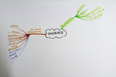
            No one commission Albrecht Durer to produce this artwork and it is created while he was in the service of the Emperor Maximilian. People who will appreciate this artwork could be historian or student who study about religion and history in the medieval age, because this artwork talk about Templar knight, crusades that happened in middle age, and also Christianity and morality.


References

(n.d.). Retrieved Aug 15, 2011, from Medusa Analysis: http://medusa.plush.org/analysis.shtml
Adams, C. (2007). The Knight, Death and Devil. Retrieved Aug 2011, from The Durer Hypothesis: http://www.thedurerhypothesis.com/Knight,%20Death%20and%20Devil.html
Bowman, D. (2008). Knight Death Devil-Knight Templars. Retrieved Aug 2011, from Aiwaz Net: http://www.aiwaz.net/knight-death-devil-knight-templars/a12
British Museum. (n.d.). Albrecht Dürer, Knight, Death and the Devil, a copperplate engraving. Retrieved Aug 2011, from The British Musuem: http://www.britishmuseum.org/explore/highlights/highlight_objects/pd/a/albrecht_d%C3%BCrer,_knight,_death.aspx
Grand Lodge. (2007). Myth of the Baphomet. Retrieved Aug 15, 2011, from Grand Lodge of British Columbia and Yukon: http://freemasonry.bcy.ca/anti-masonry/baphomet.html
GSTT Co. (2001). Albrecht Durer . Retrieved August 2011, from German Toasting Glasses: http://www.german-toasting-glasses.com/information_library/albrecht_durer_chalice.html

Saturday, 13 August 2011

Kitsch?

What is 'Kitsch'?
The word 'kitsch' only became familiar to me after Dr. Ray mentioned it during lecture class. Basically kitsch refer to tawdry, vulgarized, or pretentious art, literature, etc, usually with popular or sentimental appeal and in the perspective of art 'kitsch' is a form of art that is considered an inferior, tasteless copy of an extant style of art or a worthless imitation of art of recognized value.


Kitsch happens in Malaysia too?
During the last few lecture class we were discussing about Egyptian and Greek culture that influence us especially in the aspect of architecture which is more easily to be found around us. Does it really means a lot to us like those Egyptians or Greeks?or just a simple decoration. Does this applies the theory of 'Kitsch'? Images below are the type of houses that we can easily found around us.


Greek column elements also applied in these houses but most of them are just as decorative without any special meaning. I don't think so they build the column is because of the greek culture or what, it might be they just simply follow the trend. I saw many of this greek column design in my hometown and sometimes i wondering why they want to put it there while the overall style is not matching. Thus, it makes me feels like the column is just purely focus on the design and not the content or culture of Greek or egyptian culture.

Friday, 5 August 2011

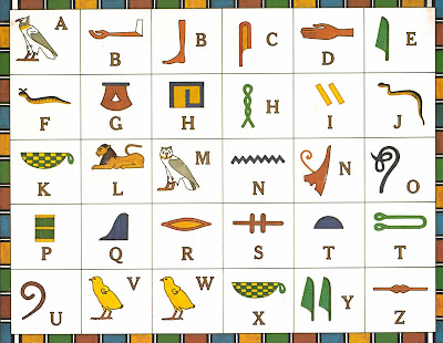
Egyptian hieroglyphs

English is based on 26 characters--letters. Letters that are combined into words and then into sentences which tell a story.


Ancient Egyptian writing uses more than 2,000 hieroglyphic characters. Each hieroglyph represents a common object in ancient Egypt. Hieroglyphs could represent the sound of the object or they could represent an idea associated with the object.


A modern type of hieroglyphic writings would be a rebus. A rebus is a picture puzzle that can be "sounded out" by reading the sounds symbolized by the pictures. When these sounds are read aloud together, the statements often becomes obvious


The Egyptian Hieroglyphics Chart


(photo courtesy of Katie S.)


Wednesday, 13 July 2011

Last Judgement of Hu-Nefer

Last Judgement of Hu-Nefer, from his tomb at Thebes Egypt, 19th Dynasty, ca. 1290-1280 BCE. 
Painted papyrus scroll, 1’6” high. British Museum, London.

Tutankhamen’s mummy case shows the boy king in the guise of Osiris, god of the dead and king of the Underworld, as well as fiver of eternal life. The ritual of the cult of Osiris is recorded in the so called Book of The Dead, a collection of spells and prayers. Illustrated papyrus scrolls, some as long as 70 feet, containing these texts were the essential equipment of the tombs of well-to-do person


The scroll of Hu-Nefer, the royal scribe and steward of Seti I, was found in his tomb in the Theban necropolis and represent the final judgement of the deceased. At the left, Anubis, the jackal-headed god of embalming, leads Hu-Nefer into the hall judgment. The god than adjusts the scales to weigh the dead man’s heart against the feather of the goddess Maat, protectress of truth and right. A hybrid crocodile-hippopotamus-lion monster, Ammit, devourer of the sinful, awaits the decision of the scales. If the weighing had been unfavorable to the deceased, the monster would have eaten his heart. The ibis-headed god Thoth records the proceedings. Above, the gods of the Egyptian pantheon are arranged as witnesses, while Hu-nefer kneels in adoration before them. Having been justified by the scales, Hu-Nefer is brought by Osiris’s son, the falcon-headed Horus, into the presence of the green-faced Osiris and his sister Isis and Nephthys to receive the award of eternal life.
In Hu-Nefer’s scroll, the figures have all the formality of stance,shape, and attitude of traditional egyptian art. Abstract figures and hieroglyphs alike are aligned rigidly. Nothing here was painted in the flexible, curvilinear style suggestive of movement that was evident in the art of Amarna and Tutankhamen. The return to conservatism is unmistakable.

Greek,Egypt and Roman Cultural Influence In Malaysia


St George Church in Penang


The picture shown above is St George Church in Penang and it is the oldest Anglican church in Penang. Besides that, it is a Greek design architecture. Greek elements were added in this building might because of during that period we were colonized by the west, so the design style of building also got influenced. As can be seen from the column, the top part of the column is flat and simple which also likely to be seen as the doric column of the Greek. The purpose of putting doric column design In it might because of the upper part of the building is more floral design and tectile texture applied and the bottom part tend to be more plain to balance up the overall design. 


National Stadium in Bukit Jalil
The picture shown above is the National Stadium of Malaysia and below is the Panathenaic Stadium in Greence. The specialty of Panathenaic stadium is the ancient model of athletics tracks that looks much like a hairpin. National stadium of Malaysia added this hairpin element into it might because of during that time the designer of the stadium influenced by the art culture of Greek and also the effectiveness of the design. The purpose of added this element into the design might because of the capability of the design to occupied people is higher and it is standardized for the athletics design. In Greek, the Panathenaic stadium meaning ‘stadium of all the Athenians’ some people also call it Olympic stadium. Hence, Malaysia had made it because our National stadium is the best stadium in our country and the stadium is now used for a variety of events, and it also being one of the venues for the AFC Asian Cup.


National Museum of Malaysia


The picture shown above is the National Museum of Malaysia. The mural of the building is chronologically documents the significant events of Malay history, including the eminent Malacca Malay Sultanate, colonization and the independence of Malaysia in 1957. In Egypt art culture, they like to paint their historical event or activities on the wall in horizontal way to show a flow of the process. National museum’s concept is similar with the Egypt culture which painted the historical activities on the wall. The purpose of applying this element into the design because by doing this we able to express or show our culture to the public more effectively.


 SEGI University Kota Damansara
The picture shown above is the SEGI University in Kota Damansara. The new flagship campus boasts a unique architecture, inspired by colonial and roman designs. As in the picture, we can see several types of column in there, the column in the middle likely to be seen as the roman ionic column because there is a pair of scroll design on the top part of the column and we can see there are many doric column beside there. The purpose of using these design make any space more beautiful and unique. They can be made in various sizes, fitting anything from a small interior hallway to a large exterior portico or outside stoop. Columns add not only magnificence but also architectural and stylistic strength to a home or building, which help it to last longer and usually increasing the property value of the building.


Shah Alam Arch


The picture shown above is the arch of Shah Alam. The arch has been found during Mesopotamia period, and roman often use it in their architecture design and arch is a curved structure that is usually made of stone, brick, concrete, or more. The arch also could symbolize an entrance to a place or boarder of a certain area. The purpose they build arch is also to support small structures, such as storerooms, and people often used columns to support the roof. This design limited the size and scope of a building. As a result, builders could not construct extremely large palaces or government building.As can be seen in the picture below, the shape is likely to be the same. 

Friday, 8 July 2011

Assignment for element of design


Some research on Ai wei wei

Ai Wei Wei is born in 1957, Beijing, Ai Wei Wei’s work has been marked by a pursuit of honesty. Though he is famed for his tongue in cheek criticisms, his satires of traditional culture and his unending social responsibility, few remember that he began as first and foremost: as an artist.
Ai Wei Wei began his training at Beijing Film Academy and later continued at the Parsons School of Design in New York City. He was instrumental in the founding of the Overseas Chinese Artists Foundation as well as laying the groundwork for experimental artists in the East Village where he published three books about the future generation of artists. His work has been displayed all over the world in Australia, Belgium, China, France, Germany, Italy, Japan, Korea and the United States and recently has been commissioned by the Tate Modern.
Later his name would become famous with projects such as the ‘Bird’s Nest,’ the Olympic Stadium for the 2008 Beijing Summer Games, a project he quickly distanced himself from following completion. His role as an activist deepened, with his infamous probe of the 2008 Sichuan earthquake student deaths and the following closing of his blog.
Ai Wei Wei continues to reside in China. 

http://www.youtube.com/watch?v=lsqC2EaVl_I


Thursday, 30 June 2011

Found something about Ai WeiWei

During this afternoon i was cutting some articles from the newspaper, meanwhile i cutting the article i accidently found an article about Ai WeiWei free from the police custody. Feel glad that his free from the custody now. ;)

Sunday, 19 June 2011

IS ALL ABOUT HISTORY OF ART AND DESIGN

What do i want from this course?
First of all, probably is all about learning new things, during secondary school im always very happy when i got to design something for my friends,class, teacher and so on, and i feel its easy. However, when i really starting to understand and learn about design, only i figure out it is not simple as i though, there re many things i need to consider when im designing. I hope i could master the adobe skill, learn about how many compose things, and etc...


What do i want to be doing in 5,10,20 years time?
After my graduation,in my 5 years time i hope i can enter a company that i want and slowly strengthen my skills and develop my fame in the field of graphic design. However, maybe i will change several company to gain different experience from different working place environment. After 10 years time, i think i will just stay in a company that im already used to it or maybe thinking to start my own business or company. In 20 years time, i hope i could have my own company and have my own brand and products.


What i hope i can get in the class of history of art and design!
During the last semester, even though we were practicing many art and design skills but i don't really understand the history of those things, such as how it works that way, what is the painting about and so on. I hope i could learn something new in the class of history of art and design, such as the history of many kind of painting and some history of those artist which will be quite interesting to me.